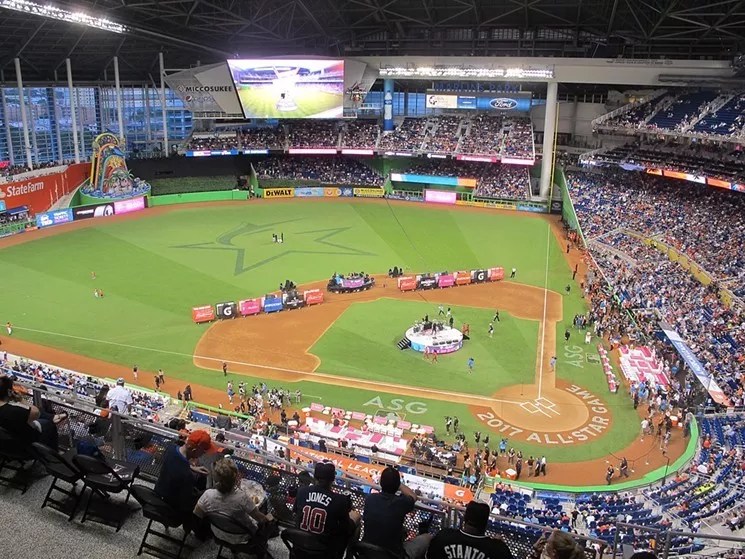
Photo by Tim Elfrink

Audio By Carbonatix
When the Marlins announced a rebranding that included a revamped logo, new uniforms, and even a skinnier Billy the Marlin, we were excited. The #OurColores campaign hype was splashed all over social media. It seemed very lit. After years of watching the team run the bases in something like a designer’s bad acid trip, we were ready.
Then the Marlins unveiled a new logo and color scheme that oddly focused on the color black. Just black. So much black. All of the black. And we wondered if they were depressed or something? Did they want to talk about it?
Who branding, who dis?
There has definitely been a 66-percent-on-Rotten-Tomatoes sort of feeling about the Marlins’ new look. But on the bright side, the updated logo and uniforms are a massive improvement from the Circus Circus Las Vegas strip look the team donned prior. Beggers can’t be choosers, we suppose.
As it turns out, a new study found Marlins fans weren’t the only people underwhelmed by the team’s new look. People outside Miami had the same feeling.
This is our town
This is our team
And these are #OurColores pic.twitter.com/vCDxCeSOpY— Miami Marlins (@Marlins) November 15, 2018
The Marlins have released a new logo and a new secondary logo: pic.twitter.com/1TkcG1EAMy
— Mark Feinsand (@Feinsand) November 15, 2018
When FanJuicer.com asked over 2,200 people what they thought of the Marlins’ official cap logo, the Fish came in 22nd among MLB teams. The same study found the Toronto Blue Rays have the most popular cap logo, while the Tampa Bay Rays plain “TB” cap was least popular among fans.
Here are a few comments from end users who were part of the FanJuice market research study:
“I was excited when I heard the Marlins might be changing to a “Miami Vice” look, but was so underwhelmed when I saw this logo. The shape of the “M” looks pretty good with the forward slant, and I like the fish wrapped around the letter. The main issue I have is that I really don’t like the colors overall. While I like the blue, I am not a huge fan of the red, and I do not understand why there is so much black. I think there was potential here but this logo doesn’t appeal to me.”
“The colors are unique and instantly tie it to Miami, but I think they over-stylized the ‘M’ in a way that doesn’t quite fit with the city. I think a more simplistic ‘M’ would have worked better. The points on the ends of the M don’t fit with the colors and vibe of the city to me, but incorporating the Marlin was cool, and the colors are awesome. I think it could have been a top notch logo if they nailed the font.”
“The new Marlins color scheme is great – uses blue and red in a very different way than other teams, and the contrasting black makes a bold statement. But the logo itself is dull, and reminds me of the 90s. There’s nothing iconic about the “M” design, and – like all other Marlins logos – the marlin image feels shoehorned in.”
“It gets a lot of positive attention because it’s new and different, but I don’t think it will stand up over time.”
“I feel like I’ve seen a lot of mixed opinions from folks. Some think that it’s a little too sleek and non-traditional while others feel like it includes interesting colors that capture the classic Miami feel.”
FanJuicer used a polling method that included matching groups of teams and asking fans which logo was “most appealing” and “least appealing.” This market research technique quickly gauges customers’ interest in a product without asking them to do much thinking or work. At first glance, the data reveals the Marlins logo isn’t doing it for most. At least not in the way they likely intended.
The 22nd place ranking is actually one spot lower than the Marlins ranked last year in a similar market research study by FanJuicer. In that one, the team’s Vegas kaleidoscope look was fans’ 21st favorite.
Luckily, the product on the field has nothing to do with the team’s hats, so the Marlins are still 0-0. It’s just a hat. People in Wisconsin can deal with it.