
Photo courtesy of the Miami Marlins

Audio By Carbonatix
Keep Miami New Times Free
We’re aiming to raise $7,500 by April 26. Your support ensures Miami New Times can continue watching out for you and our community. No paywall. Always accessible. Daily online and weekly in print.
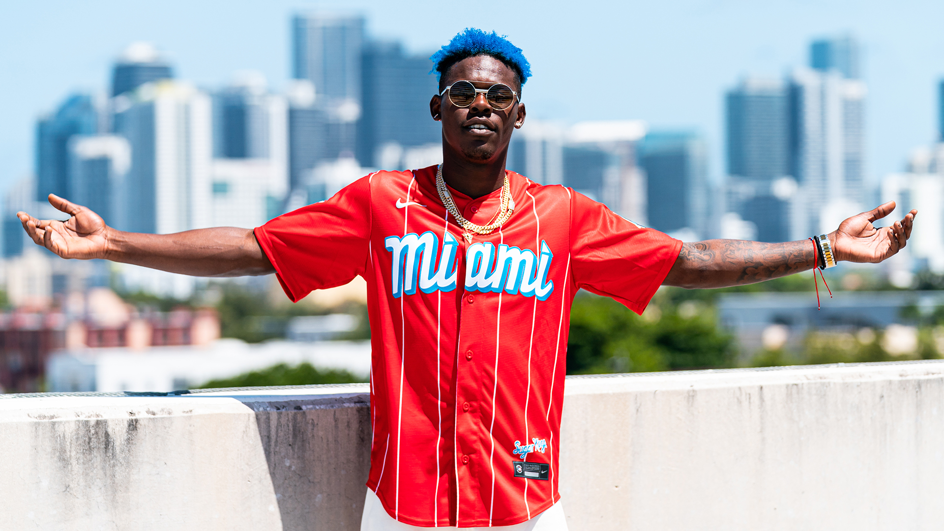
Last weekend, the Miami Marlins debuted their new Nike “City Connect” jerseys, an ode to the team’s Latin American fans and, more specifically, the Cuban Sugar Kings, a minor-league club that played from 1954 to 1960. Fan reaction to the Marlins’ new threads has been overwhelmingly positive – a rarity when it comes to alternate uniforms.
The release of the City Connect jerseys got us thinking: Are these the best alternate uniforms the Marlins have ever released? Even further, is this the best look the Miami Marlins have ever showcased on the diamond, period?
Those questions give us an opportunity to take a trip down memory lane. Let’s compare the Marlins’ new look to some of the other fashion choices the team has made over the years and see where it lands.
Great group pic.twitter.com/J6WXC6EVk5
— Marlins_Man (@marlins_man) May 24, 2021
The “Marlins Man” jerseys. As far as Marlins looks go, these were a strikeout. Please, never again.
This is nothing personal against Marlins Man – a North Miami Beach lawyer described by USA Today as the team’s “ubiquitous superfan” – but he factors in here. The orange jerseys he inspired are ugly, but what makes them worse is that Marlins Man loves them. No, he loves them. He literally made it what he’s known for. Can’t follow that.
Do you ever see anyone wearing these jerseys anymore? Anywhere? No, you don’t. Because he ruined them for everyone else. And they’re one of the ugliest jerseys to ever exist. Woof.
For the fourth time in his career, Giancarlo Stanton is an All-Star!
Congratulations, @Giancarlo818! pic.twitter.com/058YVkByjS
— Miami Marlins (@Marlins) July 2, 2017
The “carnival” look. These will forever be linked to ex-owner Jeffrey Loria. They look like he hired a bad artist to paint a jersey of what he imagined Miami looks like, while on hallucinogens.
These aren’t as bad as the Marlins Man orange versions, but they’re close. Good riddance.
The guys are rocking these and so should you!
Pick up your #PlayersWeekend merch at Marlins Park all weekend. pic.twitter.com/kJisM6DQ82
— Miami Marlins (@Marlins) August 24, 2018
The highlighter jerseys. Remember these? I barely did. These were released in 2018. Not bad. Not the worst. Definitely not the best. Points for making a jersey that I would wear to Ultra, I guess?
These seem like they could be found floating around a TJ Maxx as we speak. If so, I’d drop the $17.99.
iconic. #NegroLeagues100 ???? pic.twitter.com/5DDx1a56WT
— Miami Marlins (@Marlins) August 16, 2020
The Negro League jerseys. Sometimes less is more. In 2020, the Marlins wore Miami Giants throwback uniforms, paying tribute to the semipro team that played in South Florida in the 1930s.
While the look gains points for the great extreme throwback vibes, we need to deduct points for the confusing “GIANTS” on the front. There is literally an MLB team named the Giants. This would be like the Dolphins wearing alternate uniforms that said “PATRIOTS” on the front. Just odd.
Lilo on deck.
????: @BallySportsFL
????: @940WINZ , @radiomambi710
????: @loanDepotpark
#JuntosMiam pic.twitter.com/iBYYaYL9s6— Miami Marlins (@Marlins) April 3, 2021
The current look. The Marlins’ current home whites are an excellent look. There isn’t anything flashy or unique about them, which is likely what Marlins shot-caller Derek Jeter had in mind when he went to them. He is, after all, a former New York Yankee, a team known for one of the simplest uniforms in sports.
We’re big fans of these, but we won’t be mad if the Marlins try to improve on them.
It is Wednesday, our dudes.
It’s wallpaper time! (Sized for your phone a n d desktop.) pic.twitter.com/DmJu8QkRLI
— Miami Marlins (@Marlins) November 28, 2018
The “All Blues.” The Marlins don’t wear their extremely clean all-blue uniforms often enough. These babies are sleek. The sky blue makes for a soft look that’s easy on the eyes. It also plays well against the all-black hats that have the same blue-outlined font.
These need to be in rotation. Maybe every Sunday.
Built on history. #JuntosMiami pic.twitter.com/cmemz0ffSA
— Miami Marlins (@Marlins) May 17, 2021
City Connect. The Marlins hit a home run with their newest look. The Sugar Kings-inspired threads from Nike feel like an outfit you bought early in the summer and saved for the first day of school.
They look like clothes candy. We’re all about these. The uniforms are nice, but the MM king logo is what steals the show here. We don’t want that logo to ever leave.
Is it Throwback Weekend yet? ????
Get your ???? ready. #WallpaperWednesday pic.twitter.com/YuD3TZG7fZ
— Miami Marlins (@Marlins) July 10, 2019
The vests. Iconic. One of the best looks the Marlins have ever run out to the diamond. The vest-style uniforms will forever be a classic Marlins look that’s tough to beat.
Maybe it’s the nostalgia, but the vest and the font hold a special place in our hearts.
As well as teal can be done – 1993 Florida #Marlins @PhilHecken @UniWatch pic.twitter.com/u3n6RNemEa
— CirclinTheBases (@CirclinTheBases) September 27, 2020
The inaugural. These go so unnecessarily hard in the yard. Look at those guys. They’re sick of your shit and are just here to smack baseballs and adjust their cups. They’re so ’90s baseball it hurts.
This design always felt to me like it was the winner of a middle school contest. Some kid wrote “FLORIDA” on a piece of paper, added a marlin to the F, and BOOM – free tickets to a Marlins game, complete with coupons for a Pepsi and a helmet full of ice cream.
Another look at the throwbacks the #Marlins are wearing tonight as well as the throwback on-air graphics pic.twitter.com/hJEeNtm8jz
— Chris Creamer (@sportslogosnet) June 9, 2018
The classics. So simple, so iconic. The long-beloved classic jerseys with “Marlins” on the front paired with all-teal caps are the best look the Marlins have ever rocked.
As much as we love “Miami” being fully repped on the Marlins’ current jerseys, a huge portion of the Marlins’ fanbase lives outside Dade County. Going with just “Marlins” always felt right, even if they are the Miami Marlins. This look is right for many reasons, but most of all, because it’s the team’s identity.