
Miami Marlins photo

Audio By Carbonatix
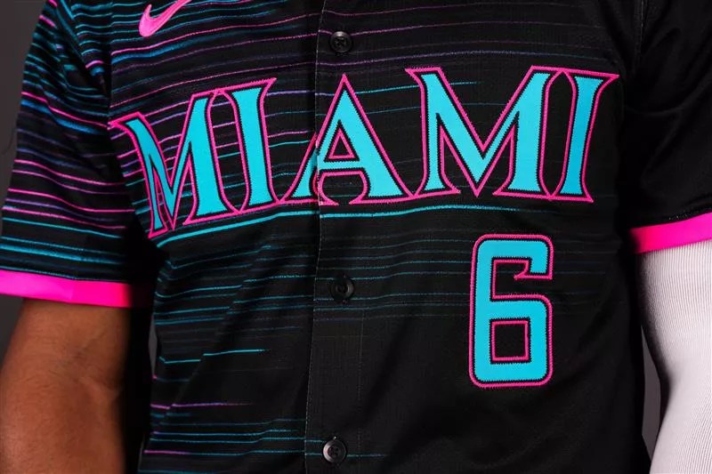
The Miami Marlins debuted their newest City Connect uniforms on Wednesday, and reactions have been mixed. Most feel the newest Nike threads are swing-and-miss.
The team bills the new “Retrowave” look as a bold tribute to the 305’s vibrant energy. And at first glance, it’s a dramatic departure from the universally enjoyed red Sugar Kings-inspired threads the Marlins utilized as their first version of the City Connect series.
“Our new Retrowave uniform combines the Marlins’ rich history with an innovative, forward-thinking approach that mirrors our organization’s trajectory,” Marlins president of business Caroline O’Connor said in a press release. “We aimed to celebrate our club’s storied past and special moments made in the teal, while looking forward to a bright future, all woven in a style that embodies the spirit of South Florida.”
This gear is a symbol of who we are – bold and united. It’s a blend of history and hope, tradition and innovation.
5.03.25 ðŸŽŸï¸ https://t.co/8CAbEESSZt pic.twitter.com/tf8FfdWSZQ
— Miami Marlins (@Marlins) April 30, 2025
The Marlins’ reveal video describes the jersey as “woven with the threads of our past, infused with teal of our legacy and accents of pink like the bright lights that paint an electric glow in the city where the party never ends.” The trailer also boldly claims that the jersey symbolizes what Miami is – bold and united, a mix of tradition and innovation.
A notable feature – or at least one the Marlins wished to note – is the inclusion of “305” on the hat. The team says this marks the first time an MLB team has incorporated a local area code into its cap design. The wordmark on the front of the jersey reads “MIAMI” in block letters that harken back to the “FLORIDA” script used during the team’s early years – a nice touch in print but not very notable when giving the new threads the eye test.
Past, present, and future-the love for beísbol and the mix of cultures create a rhythm that's loud and proud. pic.twitter.com/Ll1ejaKuqE
— Miami Marlins (@Marlins) April 30, 2025
Are the Marlins unveiling new baseball jerseys, or a blockchain? These are certainly a lot of words for a jersey seemingly destined to reside in a Ross Dress for Less near you. Honoring the past and tapping into South Beach vibes isn’t anything new, but the Marlins’ newest alternate look falls flat, regardless of how many buzzwords they put behind it.
If the Marlins aimed to honor tradition with their new jerseys, mission accomplished, just not the one you might expect. Instead of Marlins baseball lore, they’ve paid homage to the Grand Theft Auto video game franchise, channeling the retro chaos of Vice City ahead of the highly anticipated release of Grand Theft Auto VI, the often-delayed Miami-inspired installment dropping in mid-2026.
It’s not too late to claim that’s what these are. Now that would have been cool.
As we noted, upon laying their eyes on the Marlins’ newest jerseys, we noticed that the fans weren’t the biggest, well, fans of them. But don’t take our word for it; read the room.
One Marlins fan compared the “retro” waves to what you might face after dropping your iPhone:
Niiiice pic.twitter.com/qT9hPrY0Cp
— Jüstin Gardner (@JustinJGardner) April 30, 2025
Another keenly aware commenter made the compelling point that the Marlins stole the jersey concept from the Miami team featured in the 1998 movie BASEketball. We’re not gonna lie – we see it.
These are just the black version of the Miami jerseys in Baseketball pic.twitter.com/B1xB7oNW8w
— Brian Marx (@carpe_bm) May 1, 2025
Another inconsolable fan expressed disappointment, wishing the team had opted to simply honor the past by bringing back elements of previous jerseys, including the iconic pinstripe look the Marlins were known for in the early days of the franchise.
Can't we have our pinstripes back? This is…a choice? Disappointing, it has zero connection to our past; this is a sad excuse for the teal utilization of what we want. Please, your fanbase is so small, @Marlins. Just listen to us for once!
— Jonathan Lubin (@ProfLubin) April 30, 2025
In a popular take among takes, this Marlins fan expressed what many Fish fans have been clamoring for: the permanent return of the simple yet straightforward, ’90s-esque Florida Marlins pinstripe look. And truly, had the team wanted to honor tradition and history, this is what they’d do. Instead, they’ve dropped a jersey that the worst dude you know will wear to the gym.
Simplify, @Marlins.
Simplify. pic.twitter.com/XXbLuK7evm
— Matt George Moore (@MattGeorgeMoore) April 30, 2025
Regardless of what other Opa-locka Flea Market uniforms the Marlins decide to debut this season, they’ll need to pick up the pace to avoid finishing, once again, at the bottom of the MLB standings.
The sad reality of being a Marlins fan is that the team’s 12-18 start to the season is somewhat encouraging, while also good for last in the NL East. That alone displays just how low the bar has been set for the team. Sad that their new City Connect jerseys failed to achieve even the lowest expectations.