
Photo by Andrew Harnik/Getty Images

Audio By Carbonatix
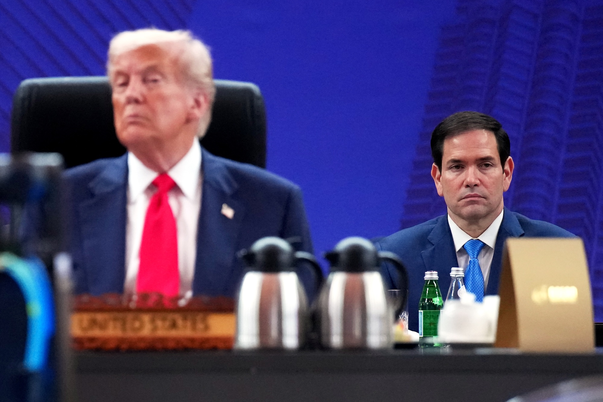
Marco Rubio has worn many hats during his time in the Trump administration. He currently serves as the secretary of state, the interim national security advisor, and the acting archivist for the National Archives and Records Administration. He served as the acting administrator of the U.S. Agency for International Development (USAID) before relinquishing the position in August.
He now has one more title to add to his resume: Font Czar.
On Tuesday, Rubio ordered the U.S. Department of State to revert to using Times New Roman font in official department communications and memos, reversing his predecessor, Anthony Blinken’s, decision to use the Calibri font, which Rubio dubbed a “wasteful” diversity program.
“To restore decorum and professionalism to the Department’s written work products and abolish yet another wasteful [Diversity, Equity, Inclusion, and Accessibility] (DEIA) program, the Department is returning to Times New Roman as its standard typeface,” the December 9 cable sent to all U.S. diplomatic posts stated. “This formatting aligns with the President’s One Voice for America’s Foreign Relations directive, underscoring the Department’s responsibility to present a unified professional voice in all communications.”
“The Times (New Roman) are a-Changin,” read the cable’s subject line.
In January 2023, Blinken directed the department to adopt the modern sans-serif font to make it easier for people with visual disabilities who use assistive technology, such as screen readers, or have difficulty reading. The department’s Office of Diversity and Inclusion, which Rubio has since abolished, recommended the switch. The directive said the serif font Times New Roman “can cause visual recognition issues for individuals with learning disabilities.”
Calibri is viewed as more accessible because of its wider spacing and rounded shapes, whereas Times New Roman features serifs, small decorative strokes at the end of letters, which can make words harder to read. Prior to the change, the department had made Times New Roman its official typeface in 2004.
As the New York Times noted, Rubio’s directive argued that serif fonts originated in Roman antiquity (perhaps proving that men are still obsessed with the Roman Empire) and are “generally perceived to connote tradition, formality and ceremony,” pointing to their use by the Supreme Court, the White House, and on the side of Air Force One.
“Switching to Calibri achieved nothing except the degradation of the department’s official correspondence,” he said.
If Times New Roman still isn’t historic enough, Rubio could always reach for Fraktur, the typeface prominently used in Nazi Germany.